A Short Guide to User Interface and User Experience
Traditionally, designing for user interface and user experience is a part of the field of instructional design. Much like human performance improvement, though, it has become a specialty field all its own. When designing any type of learning a major focus must be on how the learner accesses the learning material and creating an engaging learning environment. If the layout and controls of the educational space are unintuitive and confusing, and/or the learner becomes frustrated with the style or ‘feel’ of the way the content is presented, you will lose that student, particularly if the student is an adult. Adults choose to be in a learning situation and will walk away if their needs are not met or they think they are wasting their time.
There are many definitions of user interface and user experience (UI/UX). Some people use the terms interchangeably while others delineate the two. I use the terms as being separate but related. User interface refers to the controls of a program, how easy is it for the learner to navigate through the learning space, moving from one screen to another and clicking on commands or objects. User experience has to do with the satisfaction or frustration a learner experiences when working within an educational or training program.
Either way both UI and UX need to be designed for maximum effectiveness. I am talking here in terms of online or otherwise computer-generated learning environments, but any kind of interaction between a learner, the learning content and the learning space needs to be designed.
Let me give some examples in terms of creating an online class. When a student opens the home page of a course, what do they see? A brief menu of items down one side of the page? A short description of the course just below the name? The name of the teacher? A calendar?
These things may be necessary, but they are the bare minimum. There is no mention of course navigation or student expectations for the course- what the student can be expected to learn. In other words, there are no course goals.
Or… is there a complete description of the course, including assignments and due dates? A paragraph biography of the professor with his or her picture, or an introduction by the teacher setting the tone of the class? An explanation of the course goals and how the assignments will help the student reach those goals? Professor office hours and several ways to contact him or her? What about IT help desk contact information? Or a section devoted to resources that will help students in the class, from library info to writing help websites?
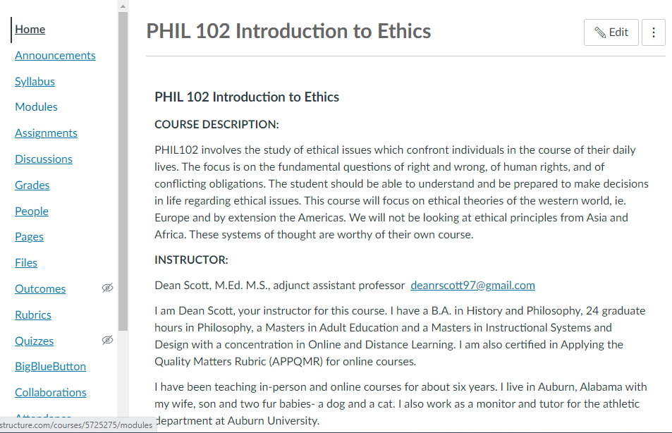
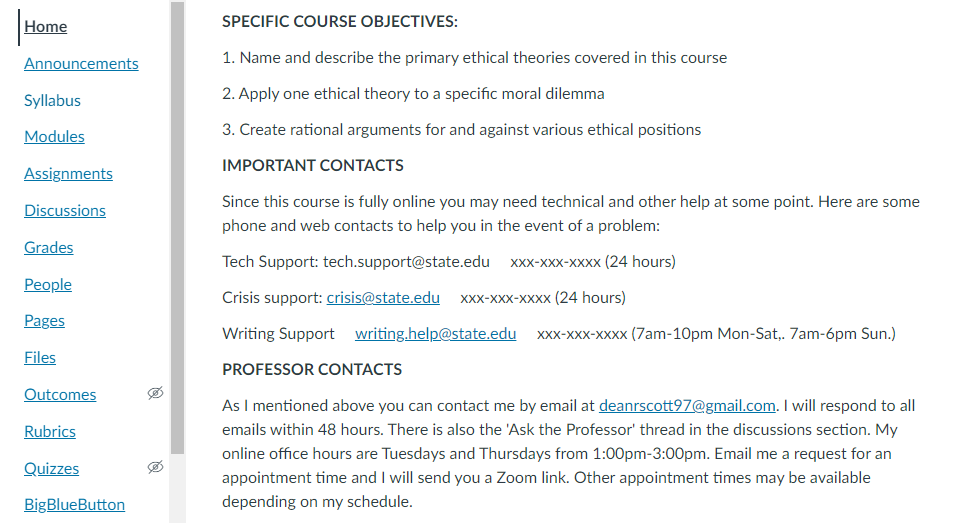
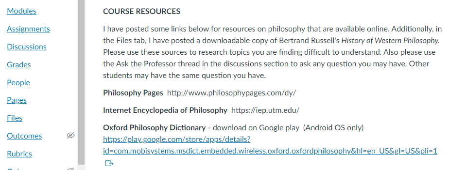
As an example I have below three screenshots of a philosophy course I created in the Canvas Learning Management System (LMS). These screenshots show the home page of the course:

This is the first section of the home page. The two sections of text introduce the course and give a short description of who I am as the instructor. The vertical menu on the left is the course navigation.

Further down the home page I have given the specific course objectives, important resource information and information on how to contact me as well as my office hours.

Here I have given the addresses of some websites for philosophical dictionaries as extra class resources. As noted in the text, I added in the Pages section a copy of a standard history of philosophy for those students who want to further explore the subject.
Having all the information students need clearly presented reduces frustration and cognitive load. This falls under user experience (UX). Including active links for information and easy navigation are aspects of user interface (UI). In the Canvas screenshot examples above the course menu is seen on the left. All tabs or items can be used for course information and navigation, but not every menu item has to be used. Once your course is set up then the menu items that aren’t being used (or being used only by the instructor) should be hidden to reduce the number of choices students will need to look at, reducing user confusion. Only include navigation that is necessary for what the students require. Also make sure there are no broken links, and links open in new tabs or windows so learners do not have to constantly use the ‘back’ button.